Michael Panzner put up a three interesting charts earlier today...
Regards - VHF
-
Chart 1: Base Money Supply (highly inflationary)

-
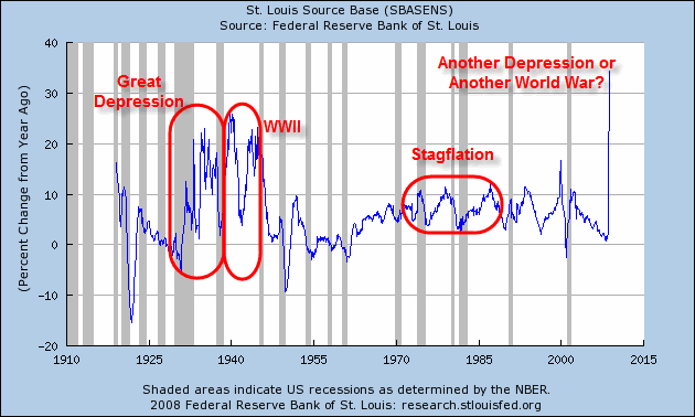
Chart 2: Base Money % Change From A Year Ago (The only other times we have seen base money supply soar like this were in the Great Depression and World War II.)
-
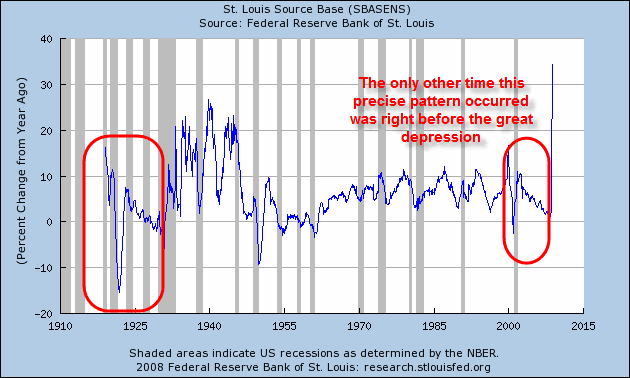
Chart 3: Base Money % Change From A Year Ago (Same as chart 2 but analyzed from a different perspective. The only other time since 1918 that the base money supply chart looks like it does recently was right before the Great Depression.)