
Charts & Comments
posted on
Aug 07, 2010 02:42PM

Saskatchewan's SECRET Gold Mining Development.

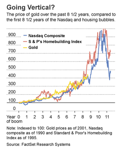
Bull Market Comparisons
The following chart compares the last 8.5 years of the gold bull market with the same period of other recognized bull markets:
I would say that the bull market in gold started in year 2000, and that it has been 10 years running so far. A good reference source using CPI-deflated charts measuring the gold bull market with the Dow bull market, where surprisingly, the analogy has turned up again and again. One thing they haven't outlined is a deflated CPI+shadowstats comparison using shadowstats.com, though that might be overstated(or understated using deflated charts):

supersize: http://www.flickr.com/photos/11747277@N07/4869524224/sizes/l/in/photostream/
source: files.me.com/fransix/k95iib
Weekly Analogous Chart
The weekly chart in gold shows analogous moves to previous rises in the gold price. Last week saw a test of the 34-week EMA. I would be looking for an RSI to pass the 60-mark:

supersize: http://www.flickr.com/photos/11747277@N07/4869552836/sizes/l/in/photostream/
Weekly GBN.V Chart
The GBN.V weekly log scale chart demonstrates that we are well within a diamond pattern, likely the break out of the top and upwards, rather than through the bottom to start a new downtrend:

supersize: http://www.flickr.com/photos/11747277@N07/4869574554/sizes/l/in/photostream/
-F6